

Free shipping on every orderQuote within 24 hours
Custom Blind Boxes

Printed Blind BoxesYour blind box design on every panel

Last updated

Printed blind boxes carry your artwork on all six outside panels, and on the inside too, for whoever opens it. Our blind box printing runs in full color on white board, so fine linework and photos come out sharp. Send your files and we'll check them for print before anything goes to press.

  • Full color, edge to edge
  • Inside print available

1 / 4

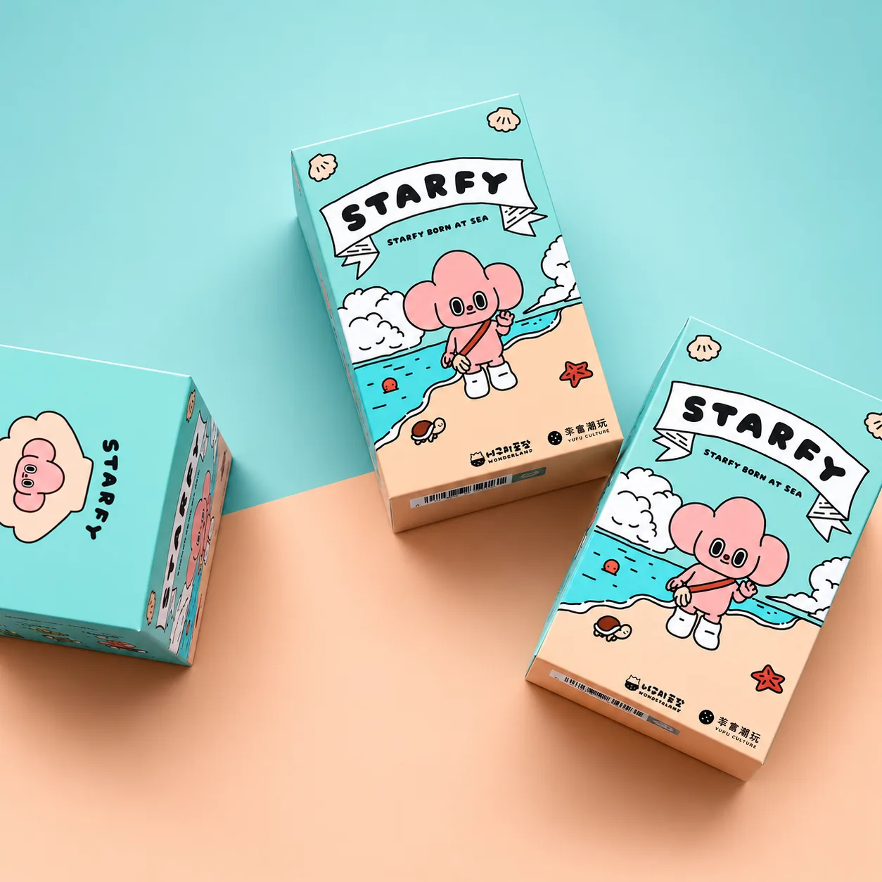
Custom printed blind boxes with full color artwork on all six outside panels
Custom Printed Blind Boxes in Full Color

Start your free estimate

A rough idea is plenty. We'll ask about anything we need.

PDF, PNG, JPG, GIF, WEBP, SVG, AI, EPS, PSD, ZIP, RAR, DOC, XLS. 20 MB max total.

    Included with every order

    • Free dieline with your order

      Your box template arrives drawn to your size, with bleed and fold lines marked, so your designer starts on the right shape.

    • Proof and 3D mockup, free

      See your design on the flat template and on a 3D box. Nothing goes to press until you approve it.

    • Made in 8 to 10 business days

      The clock starts when you approve your proof. Tell us your deadline up front and we'll plan the run around it.

    • Free shipping to five countries

      Delivered free to the United States, Canada, the United Kingdom, Australia and New Zealand. The price you approve is the price you pay.

    Built around what's inside

    Every box is cut and printed for your order, so any of these can change. Pick what suits your product and we'll quote it.

    Closes
    Tuck flap or tear-open zipper across the printed top
    Arrives
    Printed, creased and flat, ready to fold
    Best for
    Illustrated series and detailed artwork
    Size
    Your length, width and height
    Board
    18pt white board, Heavier board, Brown kraft
    Printed on
    Outside, Inside, Inside and outside
    Lamination
    Matte, Gloss
    Extra finishes
    Foil, Spot UV, Embossing, Debossing
    Closure
    Straight tuck end, Reverse tuck end, Seal end with tear-open zipper
    Design help
    Free dieline with every order, Free proof and 3D mockup

    Questions about Printed Blind Boxes

    All of it. Every outside panel can carry artwork, including the top with the zipper and the base underneath. The inside can be printed as well, which turns the moment after the box opens into a second reveal. Print the outside only, the inside only, or both.

    Lay your design on a dieline drawn to your box size, so each panel lands where it should. Work in CMYK at full print resolution, run background art past the cut lines, and keep words clear of the folds. You can make a free template at your size before you order.

    White board is the pick for full color, illustration and soft gradients included. On brown kraft, bold spot colors look their best, sitting on the natural brown for a warm, handmade finish. Both make good blind boxes, so choose the look that suits your series.

    We go over every panel when your artwork arrives, looking for words that sit on a fold and pictures too low in resolution to print crisply. If something needs a small fix, we can make it for you. Nothing prints until you've approved a final proof.

    Matte lamination is our clients' favorite: colors look soft and even, and photos of the box come out without shine. Gloss lamination pushes the same artwork deeper and brighter. For one detail that should catch the eye, add foil or spot UV on top of either.

    How blind box printing works

    Blind box printing puts your artwork onto flat sheets of board, which are then cut and creased into boxes. On white board the artwork prints in full color, so illustration and photos carry over as you drew them. On brown kraft, a few strong spot colors sit on the natural board. Either way, the printing happens while the box is still flat.

    It starts with your files. Before anything is scheduled, we read through the artwork panel by panel, looking for trouble like lettering that lands on a fold or an image that's too small to print sharp. Anything bigger than a quick fix comes back to you with a clear note. Then you get a digital proof and a 3D mockup, and the job waits for your approval.

    Full color on white board is built from four inks: cyan, magenta, yellow and black. Laid down in tiny dots, they mix into nearly any color you can design, which is why photos and detailed character art reproduce well. It's also why your files should be set up in CMYK, the same four colors the press uses, and not the RGB colors a screen shows.

    Kraft printing works the other way round. Instead of building colors from dots, you choose a small set of solid colors and print them straight onto the brown board. The board itself becomes part of the design and gives a series a crafted feel. Bold shapes and two or three colors that sit well together suit it best.

    The inside can be printed too. It's the first thing the buyer sees after pulling the zipper, which makes it a natural spot for a thank-you note or a pattern that carries on from the outside. It's an easy panel to forget, so it's worth pricing from the start.

    After printing, the sheets are laminated in matte or gloss, extra finishes go on, and each box is cut out and scored for folding. They ship flat, ready to fold. Counting from the day you approve the proof, the run takes 8 to 10 business days, and you can ask for a free estimate whenever you're ready.

    Blind box design ideas that print well

    The best blind box designs are simple enough to read from across a shelf and detailed enough to reward a closer look. What they have in common is a clear focal point on the front and artwork planned around the folds, so nothing important breaks at an edge. Still deciding on board and closure? Our page on blind box packaging covers both.

    Start with one hero image. A single character, face or symbol on the front panel reads faster than a busy scene, especially on a box that may be smaller than a phone. Give it room to breathe. A simple silhouette is easier to recognize at a glance than a crowded illustration, and a plain or patterned background makes it pop.

    Big flat areas of color look clean in print and stand out in a row of other boxes. Giving each series its own main color, or each new wave a fresh one, lets collectors tell them apart instantly.

    Patterns are your friend on the sides. A repeat that runs all the way around makes the box feel finished from every angle, and because it repeats, tiny shifts at the folds simply don't show. That makes all-over patterns one of the most forgiving ideas to print.

    Fine lines are a different story. Thin linework looks great in the middle of a panel, but near a fold or a cut it can end up split across two sides. Hairline borders sitting right on the edge are the classic trap, since no box folds to a fraction of a millimeter. A thicker border, or none at all, avoids the problem.

    Small text needs to be bigger than you think. Names, series numbers and instructions look fine on a screen zoomed in, then turn tiny on the real box. Print a page at actual size and hold it at arm's length before you sign off, and trust that view over the screen.

    Plan for the opening, too. The tear-open zipper crosses the top panel, so keep faces and logos off that strip. The inside is the opposite: a blank canvas most boxes waste. A short message or a hidden character gives people a reason to keep the box after the reveal.

    Getting colors right on a printed blind box

    Colors on a printed blind box come out closest to your design when the file is in CMYK from the start and colors are chosen by their numbers, not by how they look on a bright screen. A screen glows, while board reflects light, and a few habits close most of that gap.

    Design in CMYK. Screens mix red, green and blue light and can show colors ink can't reach, like some electric blues and neon greens. A file that stays in RGB until the end shifts when it's converted. Working in CMYK from the beginning means what you design is what can print.

    Large dark backgrounds look deeper in a rich black. Plain black ink on its own can look slightly washed out over a big area, and a little of the other inks underneath fixes that. Keep small text in plain black, though, so it stays crisp at small sizes.

    If your series has signature colors, send us the CMYK values from your brand guide rather than picking them by eye. Matching by value keeps the same color on every box in the run.

    Lamination changes the mood. Matte softens colors slightly and gives the box a calm, velvety look, while gloss makes them richer and adds shine. Neither is wrong, but decide before you finalize the palette, because colors chosen for gloss can feel a little muted under matte.

    On kraft, the board is part of the color. Light inks printed on brown take on its warmth, so a pale yellow drifts toward mustard. Strong, saturated colors work best there. If a design depends on bright white, white board is the better match.

    Preparing print files for your blind boxes

    A print-ready blind box file is your artwork placed on a dieline at your box size, in CMYK, with background art running past the cut lines and anything important kept well inside them. Get those right and the file check goes quickly.

    Begin with a dieline. Every box is drawn to your length, width and height, and a dieline comes free with every order. If you want a head start, our template generator makes one to your size in a minute. Keep the dieline on its own layer above the artwork, so it can be switched off for print.

    Vector files are best where you can manage them. PDF, AI and EPS keep lines and lettering sharp at any size. For painted or photographic artwork, high-resolution images work too, as long as they're 300 dpi at the final size. An image saved from a website is almost always far too small.

    Convert text to outlines. Fonts installed on your computer may not be on ours, and outlining locks every letter in place, so nothing reflows or swaps to a default font.

    Then add bleed and respect the safe zone. Background colors and images should run about 1/8 inch past every cut line, so no thin white edge shows if a cut lands a hair off. Text and logos belong at least that far inside the line, clear of the folds. Bleed out, words in is the easiest rule to remember.

    On a series, send one clearly named file per design, named the way you want it counted. It saves a round of questions, and the file check can flag anything that needs another look before your proof is made.